Reinventing The Tattoo Forum
Home » critiques » rose with home
Rose with Home
Posted by
lornemountain@gmail.com
on 03.18.16
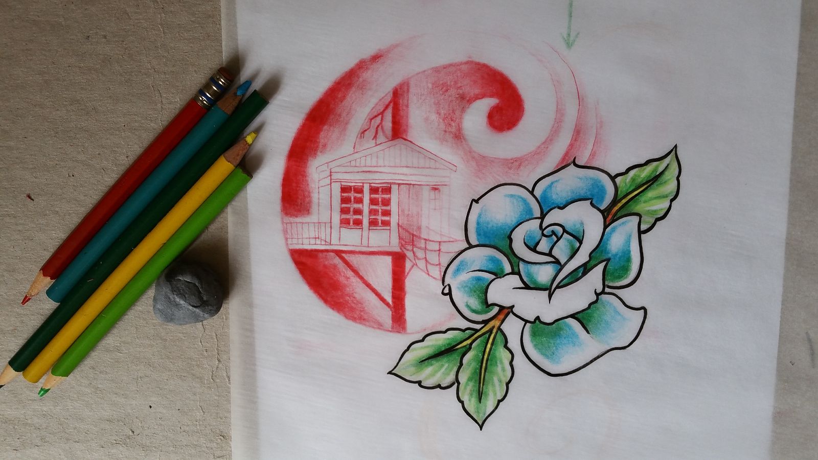
Here's a design I put together.
I'm playing with the use of two analogous colous in the forground object and the complimentary colour in the background to create contrast.
I use washed out red in the lines of the house to create more depth. I also left negative space around the house aswell as inside the lines of the house to give it a glow effect.
Let me know if there is anything I can do to translate this design better to the tattoo.

Replies:
-
109.05.2017
-
1104.10.2017
-
104.04.2017
-
104.03.2017
-
603.13.2017
-
403.13.2017
-
101.24.2017
-
101.05.2017
-
611.30.2016
-
110.26.2016
Need technical support? Call (413) 585-9134 or email