Reinventing The Tattoo Forum
Home » critiques » tattoo flash critique
tattoo flash critique
Posted by
lukemack10@gmail.com
on 11.26.15

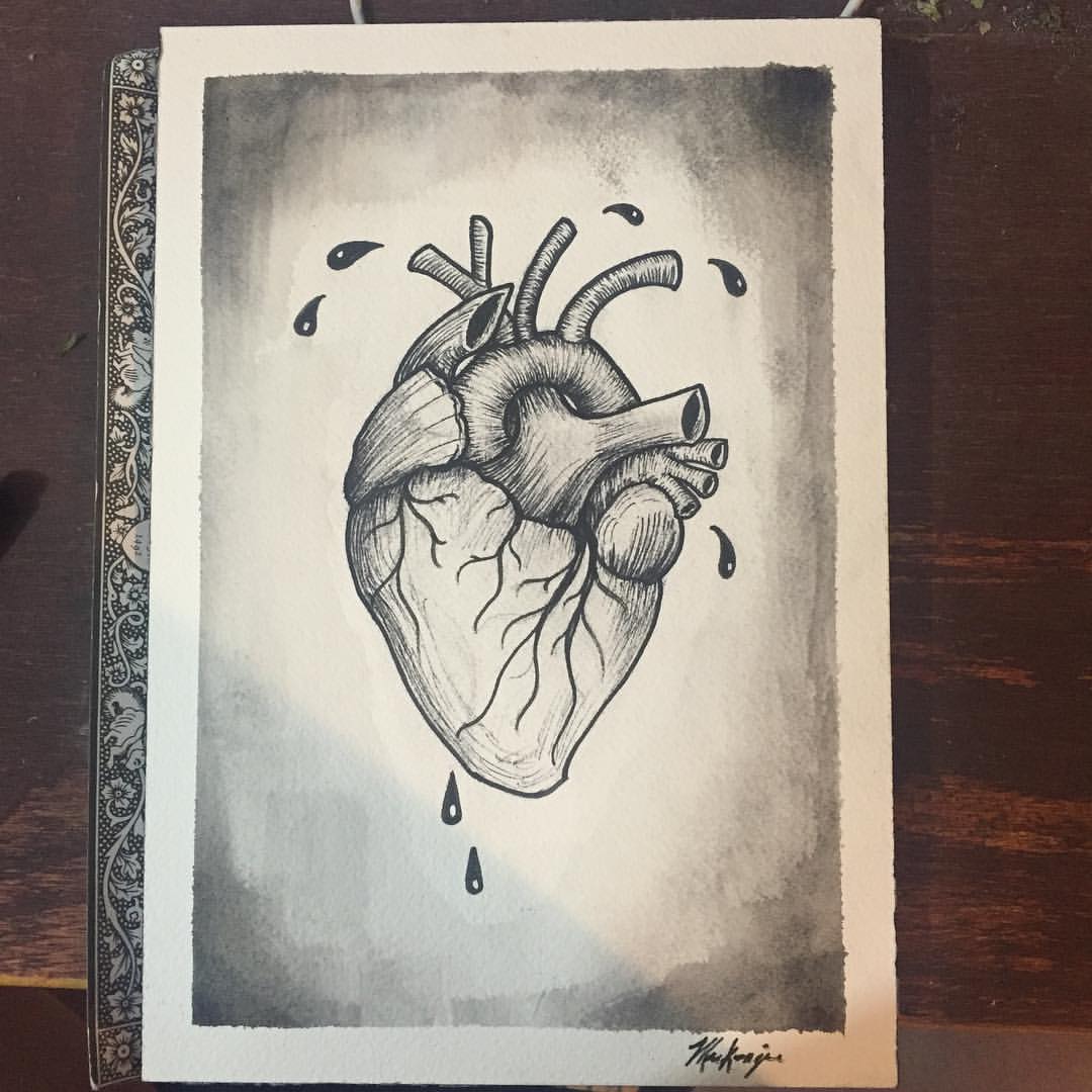
Recent anatomical heart was trying for the traditional black and grey style, any tips or pointers would be much appreciated
Replies:
RE: tattoo flash critique
Posted by
Tattoogarden.net@gmail.com
on 11.27.15
Looks good! My only suggestion would be to smooth out the gradient in the background. I'm a little confused by what traditional means anymore but I think this would certainly qualify.
RE: tattoo flash critique
Posted by
guyomech@gmail.com
on 12.05.15
I like the stylization, has this nice nineteenth century vibe. If you're planning on keeping the background blank immediately behind the heart, then the heart itself could use a bit more shading. Try some gradients that include true black, but be selective. You should be able to give it a lot more volume.
-
101.07.2020
-
106.02.2018
-
104.18.2018
-
104.17.2018
-
104.17.2018
-
203.19.2018
-
403.19.2018
-
303.19.2018
-
402.12.2018
-
111.23.2017
Need technical support? Call (413) 585-9134 or email