Reinventing The Tattoo Forum
Home » critiques » exercise 2 2a
Replies:
RE: Exercise 2.2a
Posted by
s-mcandrew@hotmail.com
on 03.19.18
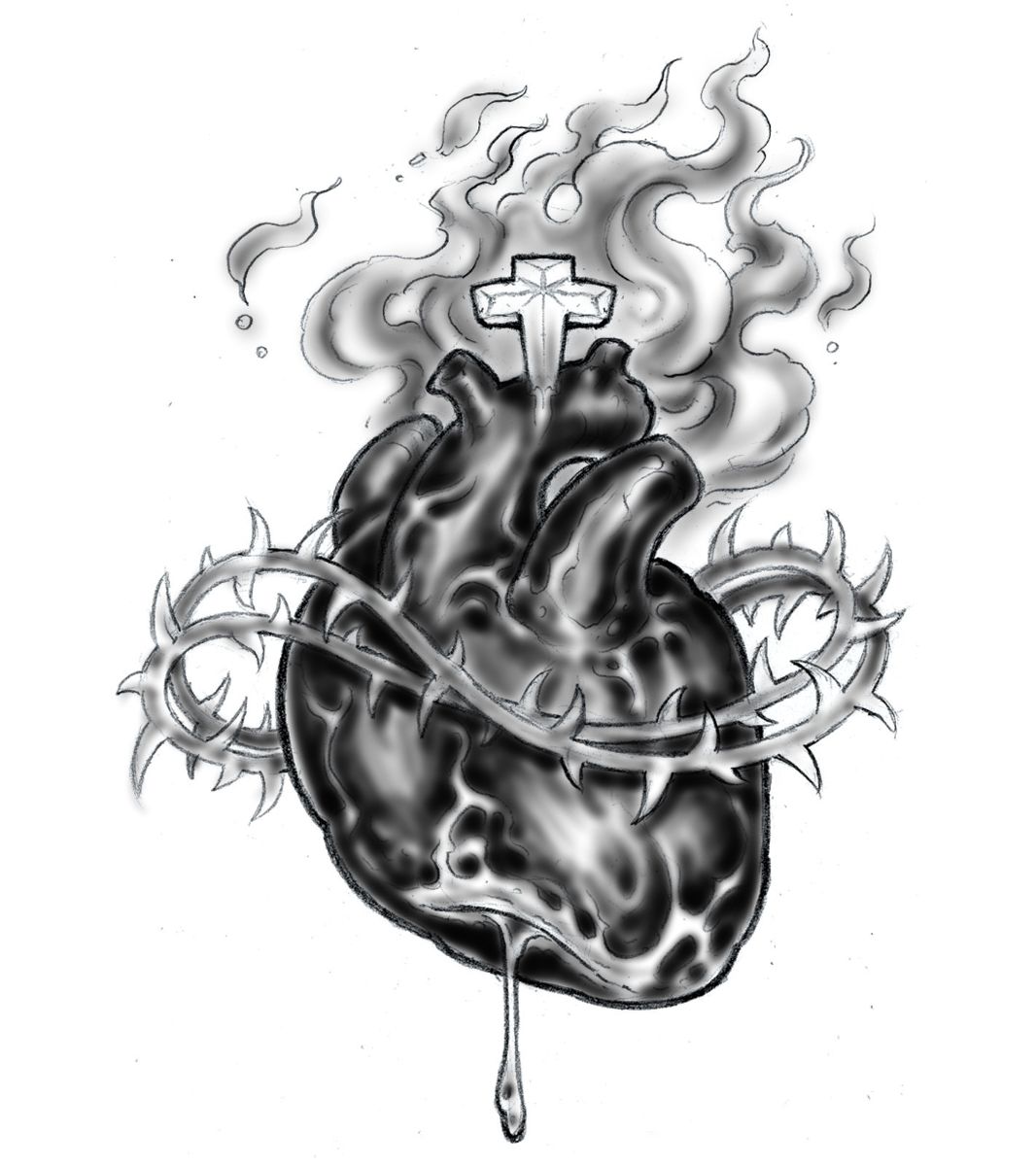
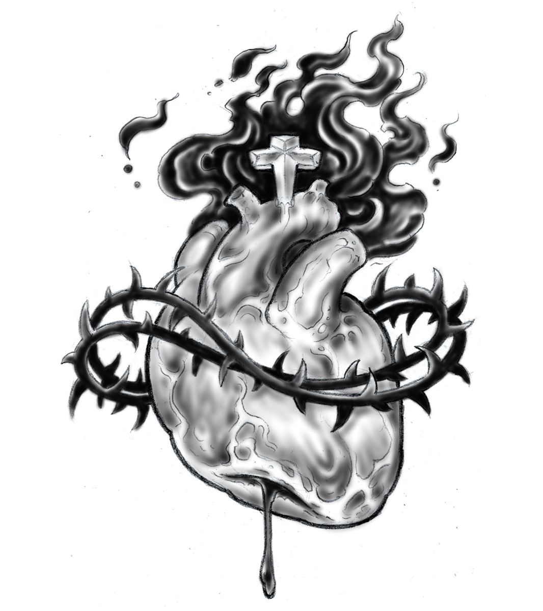
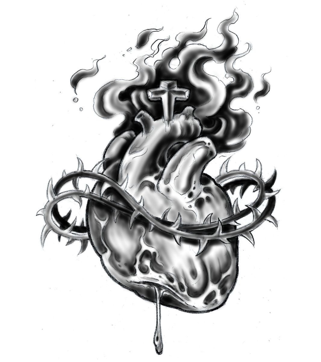
I prefer the middle design. That one seems to have the best differentiation between light and dark. The shapes stand out more where the other 2 sort of get lost in the similar amounts of dark/light/detail
-
101.07.2020
-
106.02.2018
-
104.18.2018
-
104.17.2018
-
104.17.2018
-
203.19.2018
-
403.19.2018
-
303.19.2018
-
402.12.2018
-
111.23.2017
Need technical support? Call (413) 585-9134 or email


