Reinventing The Tattoo Forum
Home » critiques » script
Script
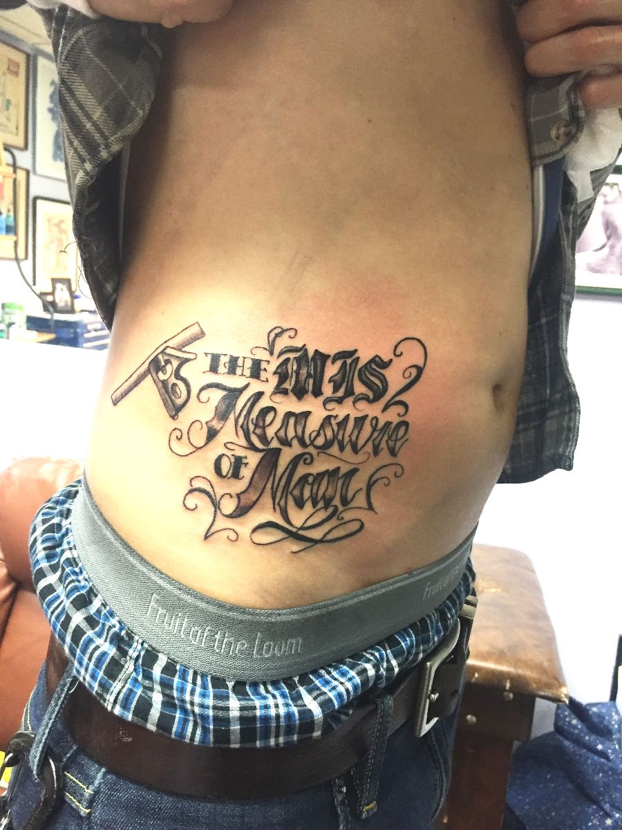
 This was done w a stencil, i can see why script is often done free hand so it fits the body better
Replies:
RE: Script
This is a tough spot for straight lines. I rarely freehand script, but I do usually take a map of the area and get the flow and overall size worked out first, then lay the letters in over the map. Using the curve over the hip bone as the base line for the letters would help with the flow. Maybe using straighter lines for the vertical guidelines would keep it from being too feminine. Also, a little overlap with the design elements and the square might help tie the image together. Hope that helps!
RE: Script
Thank you for taking time out to look and yes that does help very much ! Cheers
RE: Script
I agree about following the hip bone for a good curve. I just watched the Big Meas DVD about lettering and highly recommend it, it's quick and to the point and has some great ideas about using the body part well. (We carry it at TattooEducation.com, along with five great lettering books by BJ Betts)
it also looks like you struggled a bit with the lines- a lot of that will come with practice, but try this: each time you are about to pull a line, plant your hand, get a stretch, then do a quick "practice swing" to make sure your hand position works for the whole line. Then repeat for each line... Make sure you don't overreach or you'll get glitches in your linework.
-
412.05.2015
-
311.21.2015
-
611.15.2015
-
611.10.2015
Need technical support? Call (413) 585-9134 or email