Reinventing The Tattoo Forum
Home » critiques » hewy from norwich uk st george
hewy from Norwich UK. St george.
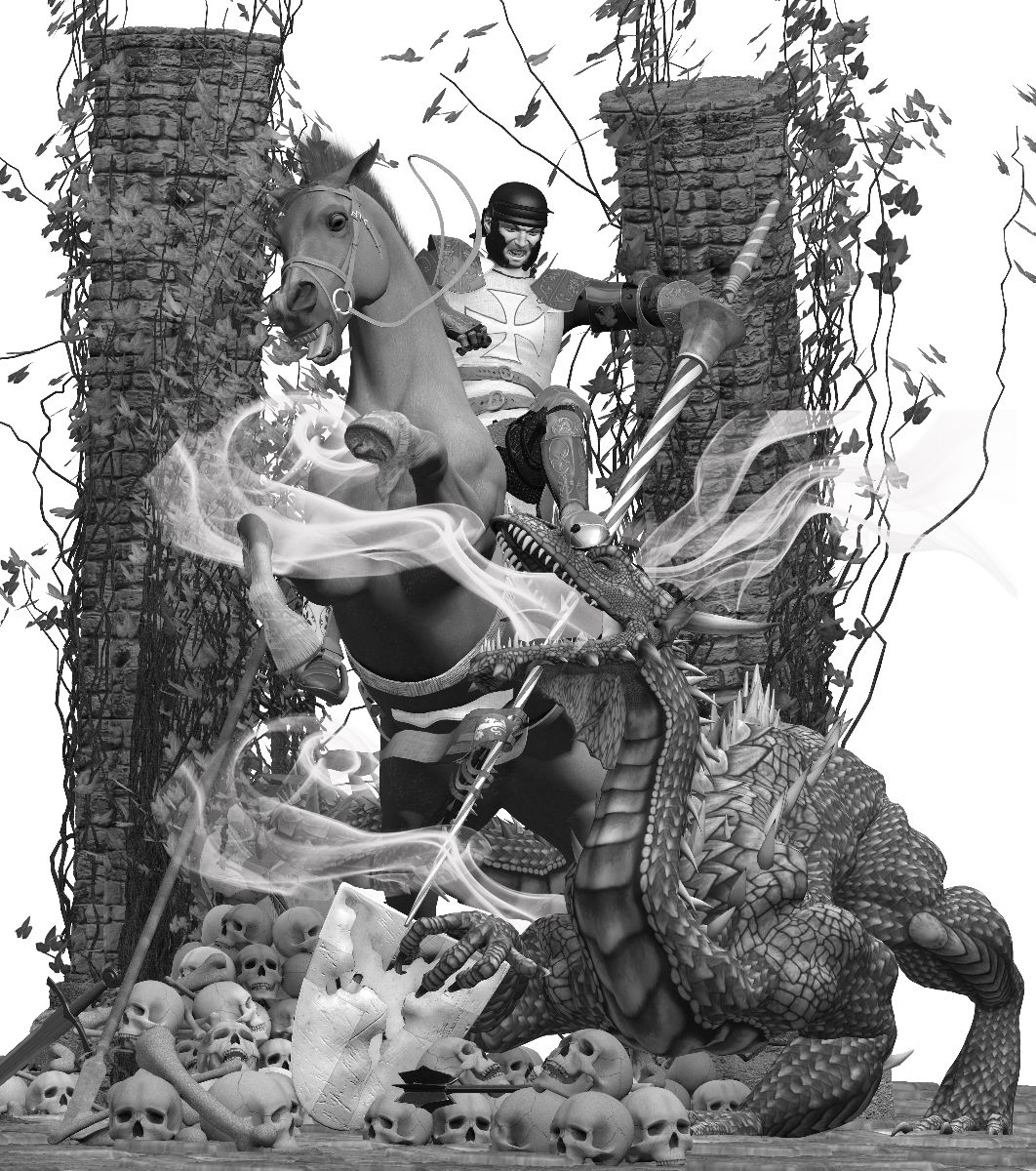
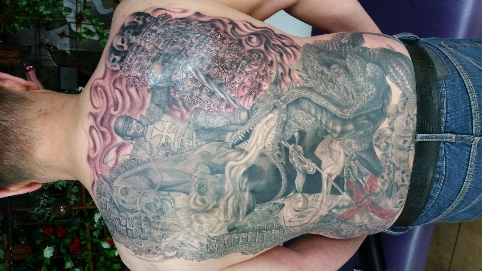
 here is a piece i just finished, so its just a phone pic so its not so good be a better pic once its healed, its was 55 hours and done with a flite v2 and t-tech and modded t-tech with other needles, my own grey wash in a drop system i use 1, 3 ,6, 12 and black, it has some o greys in it as well. the first pic is a 3d image i made in poser 10 then i used that for my refrance oh it is also a cover up as well ..... i couldnt figure out how to turn the pic, just like the old forum its a bit of a pain to upload images so this is a bit of a test to see how easy it was .... excuse the english im dyslexic and its hard sometimes to spell the words and makes things read right even with spell check.
Replies:
RE: hewy from Norwich UK. St george.
Hewey,
its an ambitious project, and I commend your use of 3D media to explore your composition. The issues are in your execution- mainly with readability. Because it's such a detailed piece, care must be taken to keep it clear and readable. One easy way (that you could still do) is use a strong black line around the figure and horse, and selective line weight around other elements based on their priority in the composition- this is a tried and true trick for making complex designs readable. If you are going gor that more realistic black and gray look, then it needs to be done by being very selective with your values. Keeping the stonework much lighter and making the shadows in the figure darker is a good example. As it stands, your shading values are too similar between your different elements which gives the piece a busy, cluttered look from a distance... Easy to fix though.
RE: hewy from Norwich UK. St george.
-
412.05.2015
-
311.21.2015
-
611.15.2015
-
611.10.2015
Need technical support? Call (413) 585-9134 or email