Reinventing The Tattoo Forum
Home » critiques » hand and locket first critique
Hand and locket - first critique
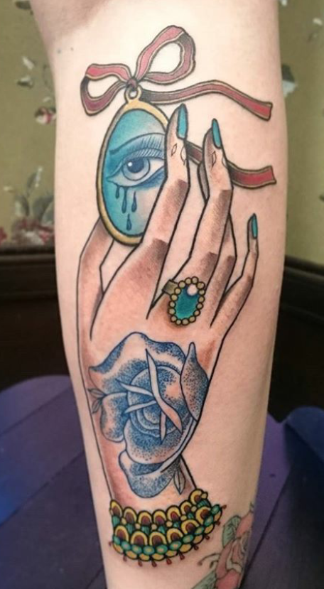
OK my first time uploading so hope it works ok. I'm really keen to be critiqued on my work. Excuse the photo is a bit over exposed at the top.

Replies:
RE: Hand and locket - first critique
Hey, nice tattoo! Very clean and well layed out. I think that the metal elements (ring, frame, possibly the bracelet) would benefit from more detailed shading. a muted brown tucked in where they go behind other elements and on the individual balls on the ring would push the volume and expand the contrast between these elements and the rose tattoo (which I think is awesome!). Perhaps a little grey shading from the inside of the frame would be nice too. In any case, It's a beautiful tattoo.
RE: Hand and locket - first critique
Thank you. I definitely agree and was thinking it was very much needed in the ring for sure. I'm still very new to tattooing so lack confidence in pushing my work further but it's all about those little details. I'm keen to hear what others have to say.
-
101.07.2020
-
106.02.2018
-
104.18.2018
-
104.17.2018
-
104.17.2018
-
203.19.2018
-
403.19.2018
-
303.19.2018
-
402.12.2018
-
111.23.2017
Need technical support? Call (413) 585-9134 or email